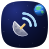
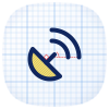
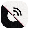
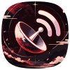
Do
- Keep the 20 % padding around the glyph.
- Use a white or single-colour glyph on a clean background.
- Show the squircle, not a square or circle.
One glyph, four strokes, and a Google-style squircle. Here is how it is built, the colours behind it, and the source files for every concept we showed.
Four strokes on a 24 × 24 grid, centred in a 100 × 100 squircle with 20 % padding.
A closed quarter-arc, radius 7.31. The anchor of the mark.
M4 10a7.31 7.31 0 0 0 10 10ZA short diagonal tying the dish to the signal.
m9 15 3-3Radius-6 arc centred on the dish.
M17 13a6 6 0 0 0-6-6Radius-10 arc that closes the composition.
M21 13A10 10 0 0 0 11 3Four cubic curves with control points pulled toward the corners give a softer shape than a plain corner radius.
M50,2 C12,2 2,12 2,50 C2,88 12,98 50,98 C88,98 98,88 98,50 C98,12 88,2 50,2 ZClick a swatch to copy its HEX.
These are concepts for the community vote, not final app icons. SVG scales without loss, and PNG exports at any size up to 4096 px.